Bar Chart
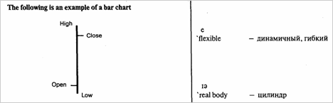
Bar Charts collect and represent price information on a vertical bar. The top of the bar is the highest price and the bottom of the bar the lowest. A tick on the left-hand side of the bar denotes the open price and a tick on the right-hand side is the close price. A HiLo Bar Chart is a vertical line that represent the High and Low prices for an interval. These charts are particularly
tick
e 'Elliottwave
— метка
— волна Эллиота
popular with Elliott wave analysts, where the only necessary information are the highs and lows. The type of chart used by analysts, always comes down to individual preference. The popularity of the bar chart is due to:
Clear representation of data.
Clear understanding of the relationship between the Open and Close (tells you the result of the war between the buyers and the sellers).
Can be used with all other types of analysis.
ae 'Candlestick Chart
to assign
график японская свечка
- называть
Candlestick Charts
As with Bar charts, Candlestick Charts use Open, High, Low and Close price data. The major difference is, that if the close is below the open, that is, if the value of the security has fallen, then the bar is coloured in black. If the Close is higher than the Open, the Bar is left clear or white. These charts are very popular among the Japanese who have assigned various names to the different coloured patterns such as hanging man, hammer and morning star. They are flexible (used on their own or combined with analysis tools). Rises and falls in the market are easy to indentify because of the colour scheme. Small candle reflects that buyers and sellers are almost equally placed. The real body represents the range between the intervals open and close. The thin lines at the top and bottom of the real body are called shadows. They represent the interval's high and low.
(black) coloured body — закрашенный цилиндр
high (low) shadow — с верхней (нижней) тенью
ai 'white body - полый цилиндр